Trauma B. Dump
3D Puzzle game
Step into 'Trauma B. Dump,' a first-person puzzle game where you're hypnotized into reliving twisted memories and conquering past traumas. Each level is a piece of your mind, filled with puzzles that mess with the environment. Manipulate those environments and solve mind-bending puzzles to find your way out. Ready to unravel your mind and escape the trauma?
Role: Level Designer/Gameplay Designer
With a challenging timeline of 3 months to complete a short game, being a small team of 7 devs, I had to juggle multiple roles. One of my core contributions to the team was as a level designer.
As the Lead Level Designer and Gameplay Designer, I contributed in designing the layout and gameplay for all 3 main level of the game.
Level 1: Tutorial
The player's POV
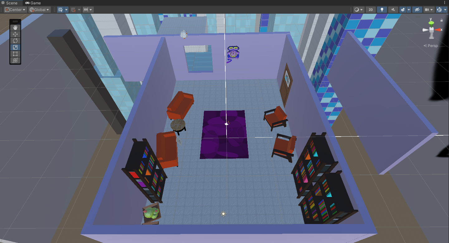
Trauma B. Dump opens up with the player in a therapist's office, exploring their past trauma as a kid. A subtle piece of enviromental storytelling I wanted to highlight through level design was their journey to childhood.
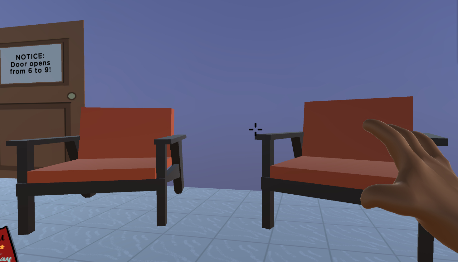
Thus, the player was made relative short, with their eye-level in line with the furniture within the room. Hinting that they are kid-sized.
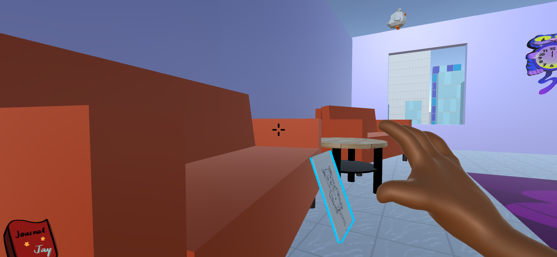
Being the tutorial level, my aim for the level is lay out the basic pieces involved in solving puzzle within our game. This being: Picking up object and moving them; solving puzzle with out of the box solution.
When the level begins, due to the placement of the player, their eye is instantly directed to the door and the clock. With the solution to this level being adjusting the "time" on the clock to unlock the door. As an additional hint, an obnoxiously loud ticking noise is present to inevitably direct attentions towards the clock.
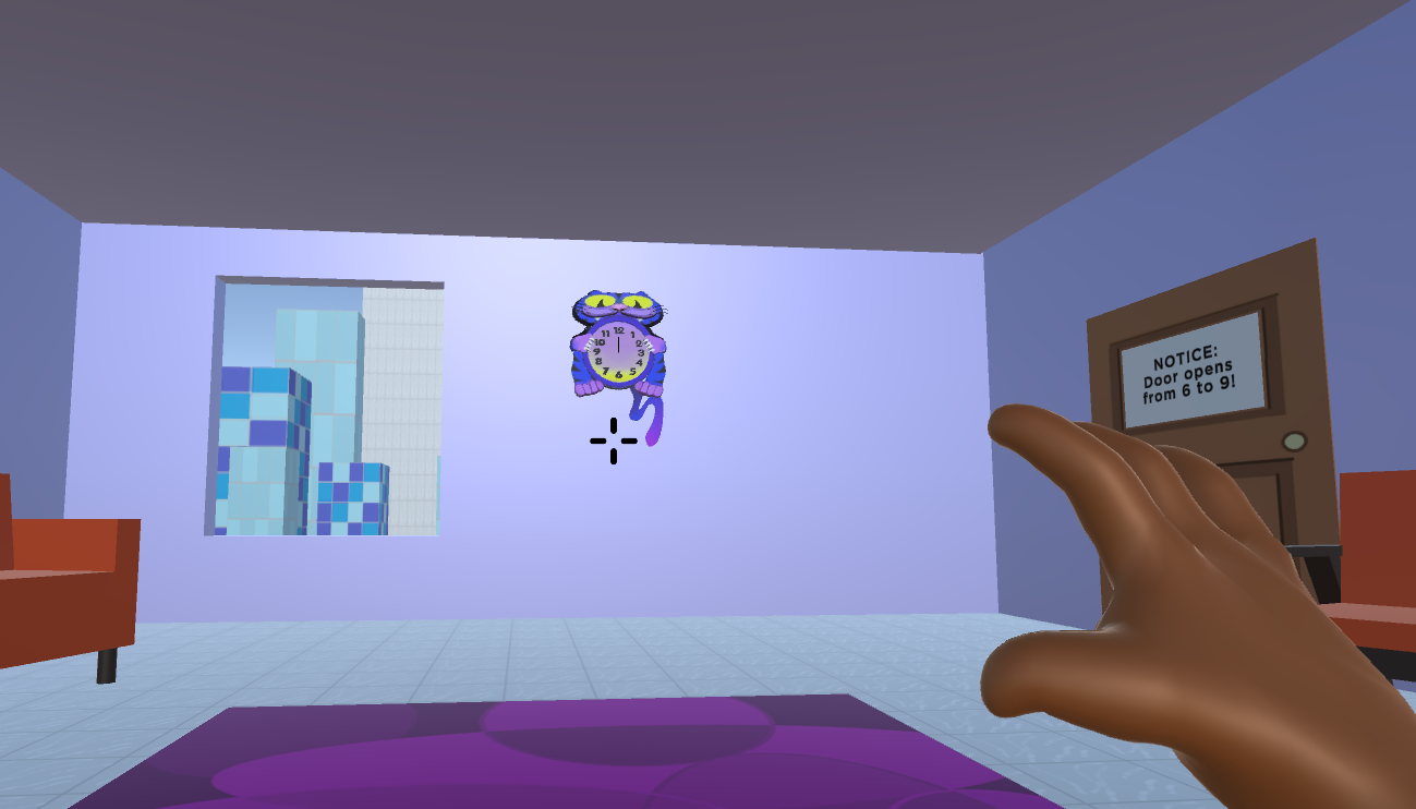
The player's POV at the beginning of the level
However, when attempting to reach the clock, the player seems too short for it, with a voice line playing hinting to perhaps standing on something to reach it.
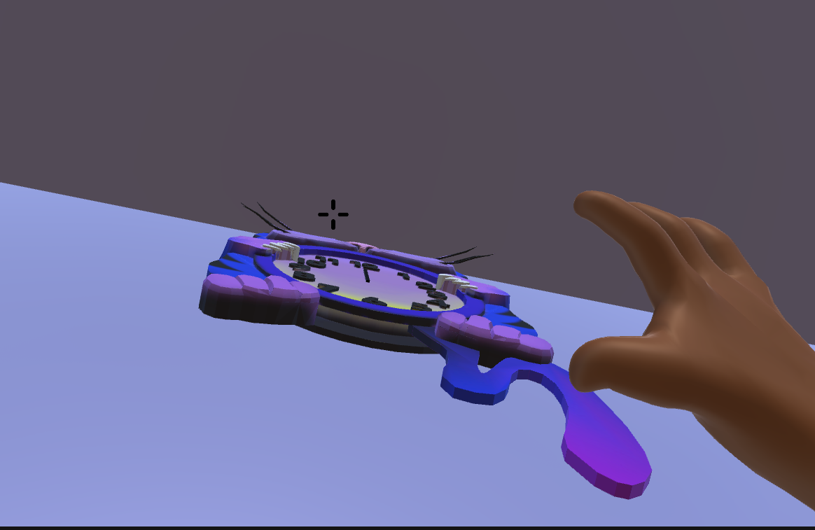
The player is too short for the clock
By scouring the room, player will find a stool that lits up, by interacting with it, the player will find that they picked it up. Moving it towards the clock and standing on it will alow player to adjust the clock
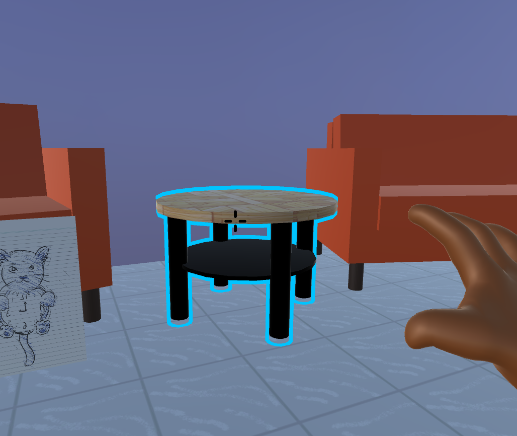
The stool litting up
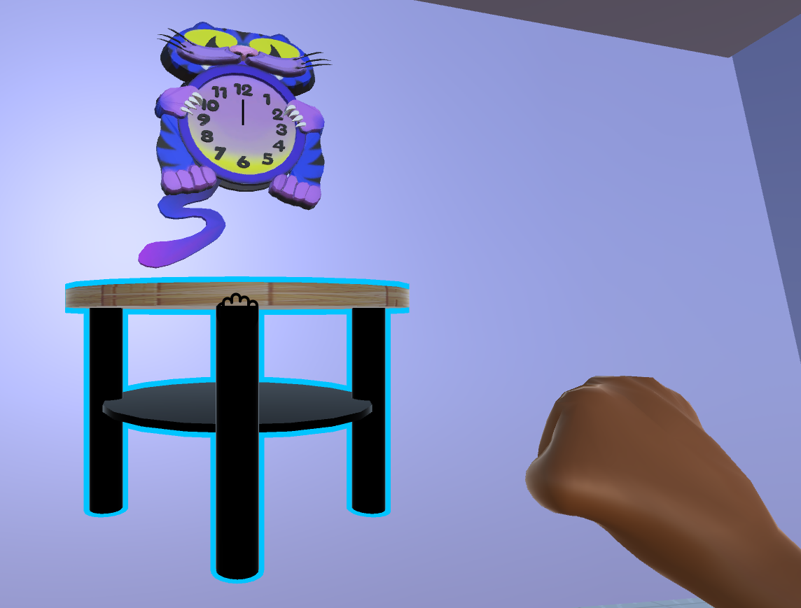
The player picking the stool up and placing it by the clock
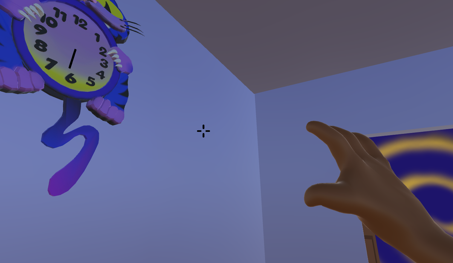
By standing on the stool, the player is able to adjust the clock and opening the door!
So the goal of the tutorial level was accomplished!
Note: Due to time constraints, some features we wanted like a button prompt pop up to explain the controls wasn't able to be implemented. Though, during playtest with players, we had an instruction showing controls. Additionally, to really direct the player to complete this level easily without much guidance, I purposedly limit the number of interactable object within the room, directing attention solely to the stool. This made the player understand that the solution of the level had something to do with the stool, the clock and the door!
Level 2: The play place

Interestingly, level 2 was designed last.
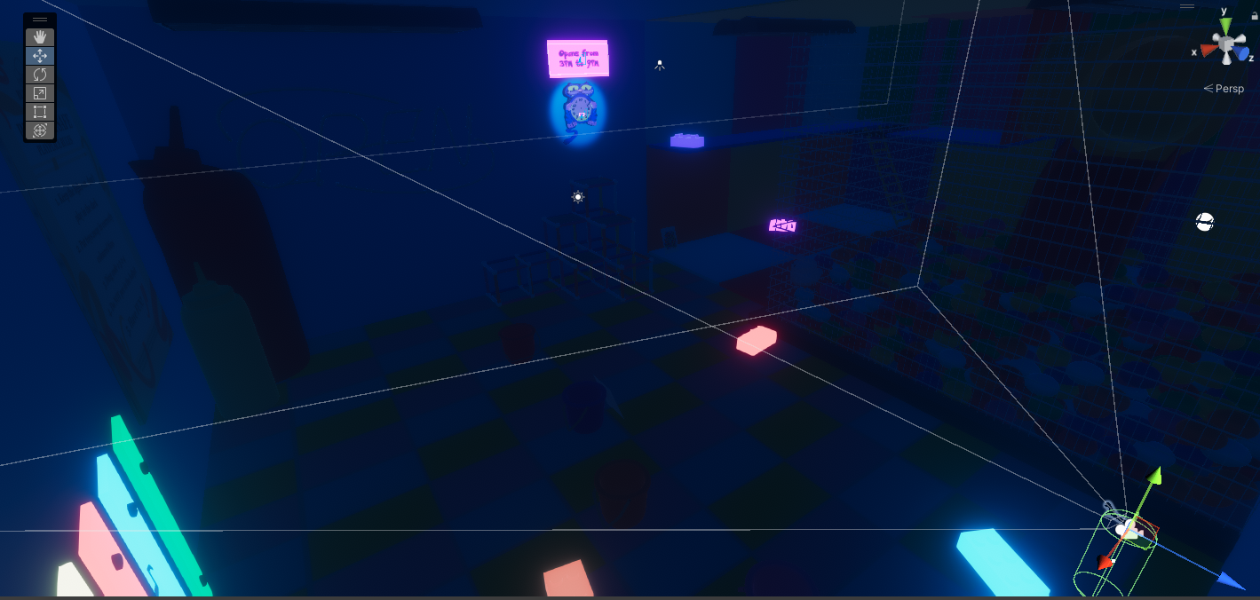
Level 2 Layout with lights off
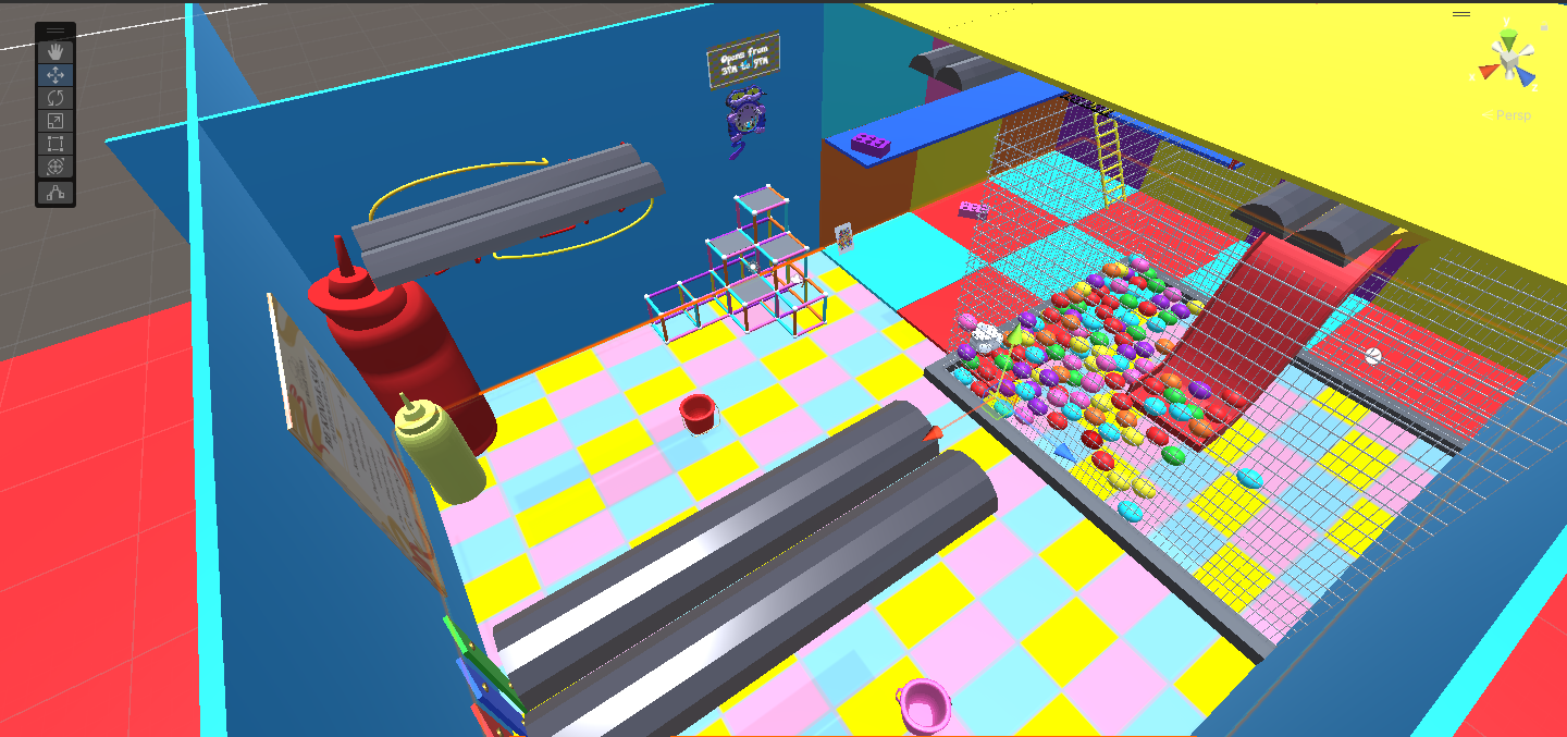
Level 2 Layout with lights on
The goal for level 2 was to build upon the mechanics introduced in level 1 while introducing new mechanics for level 3
This was inspired by Super Mario 3D World's level design 4-step approach:
Introducing a mechanic, developes it further, gives a twist to the mechanic and finally concluding it.
In Level 2, I aim to reintroduce the time changing mechanic with the clock and object placement, while introducing other new mechanics.
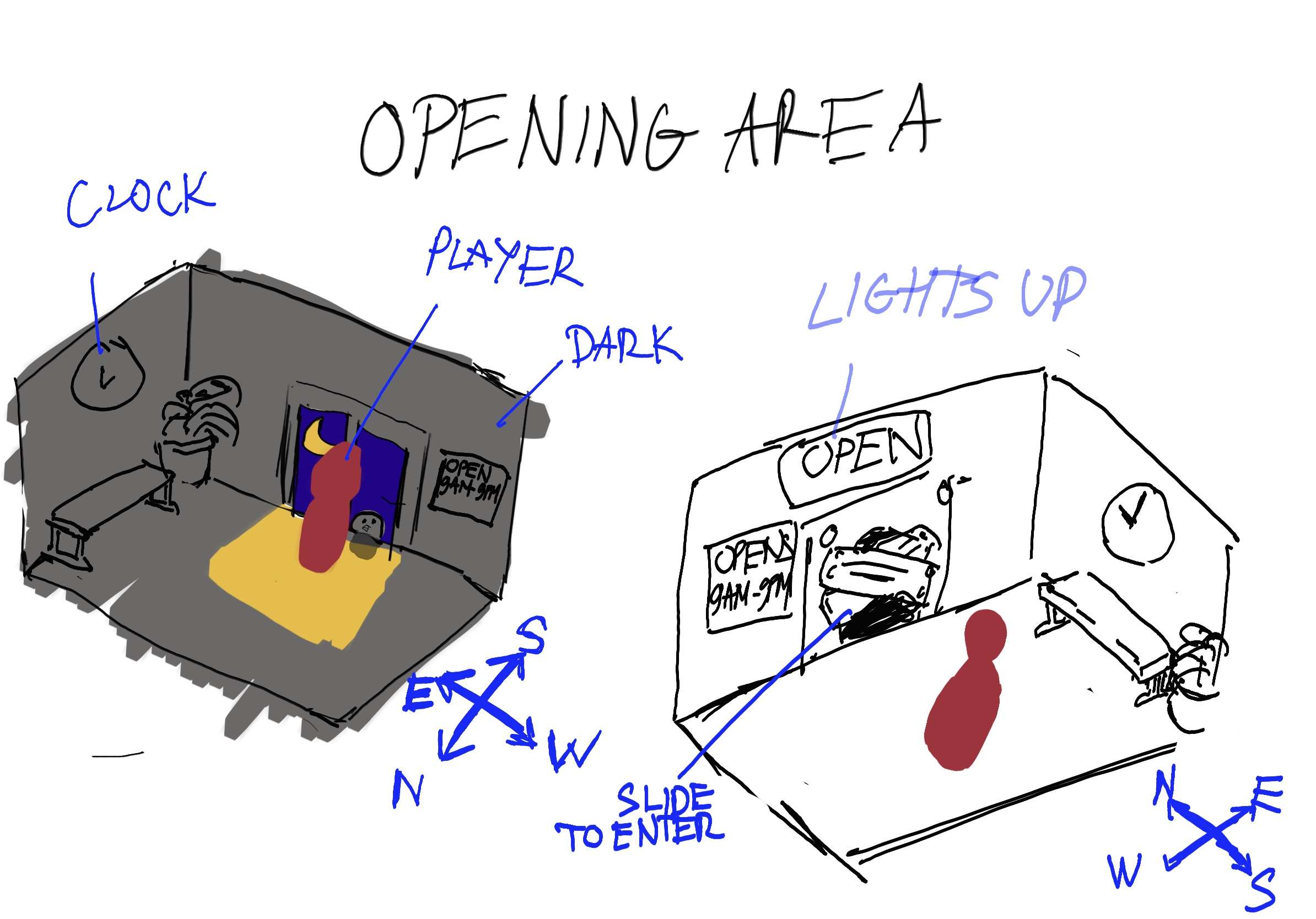
Level 2 opening section sketch
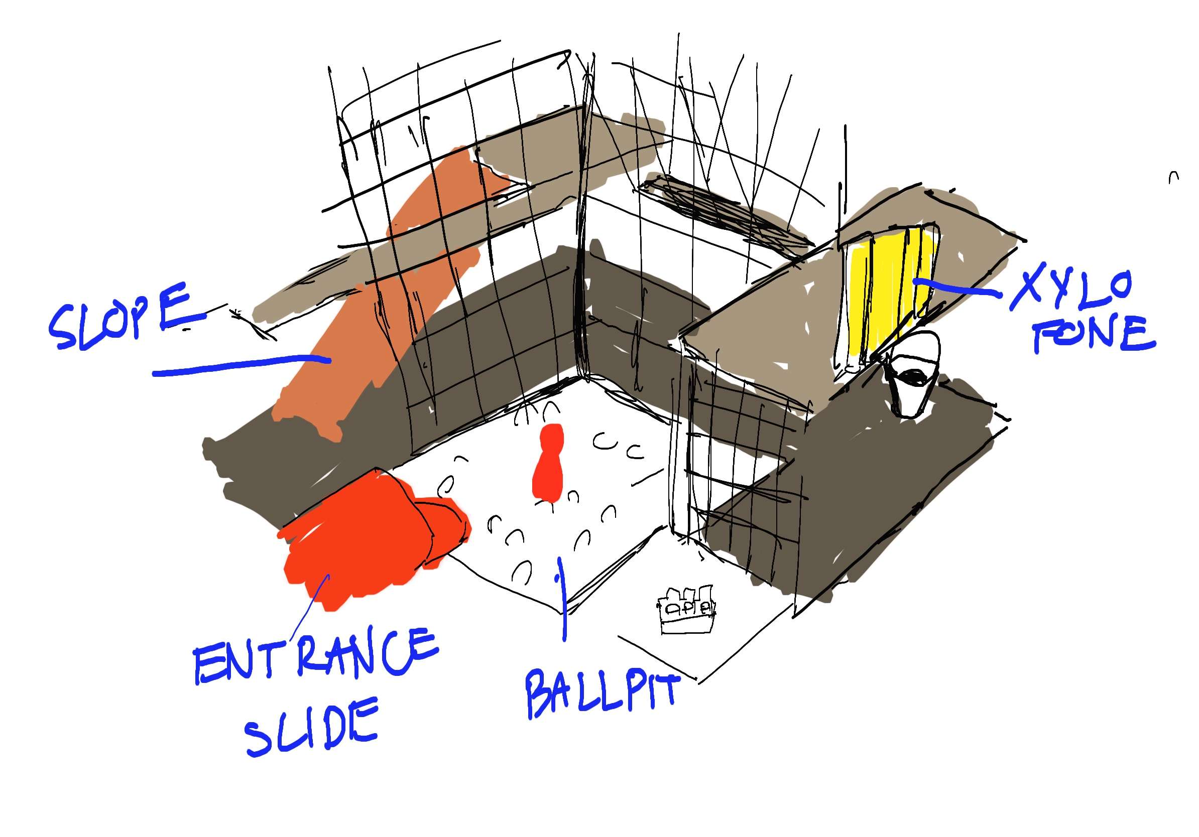
Level 2 ballpit section sketch
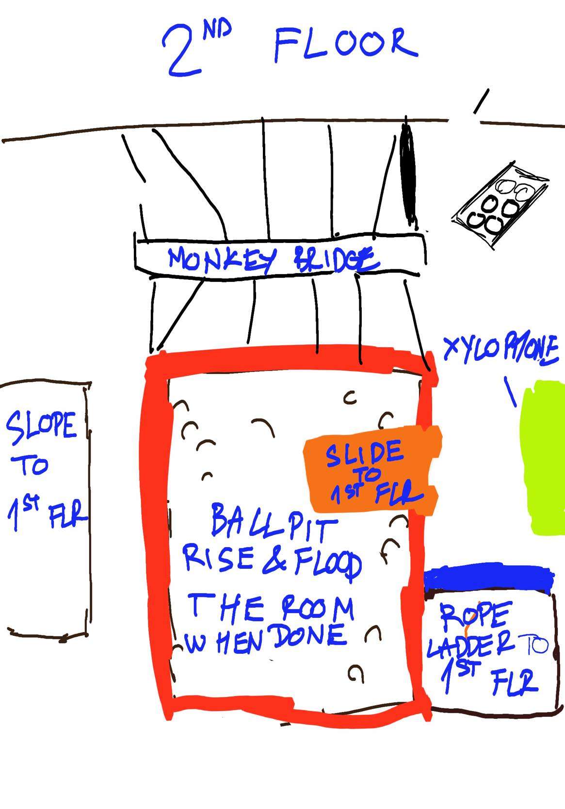
Level 2 2nd floor top-down view sketch

Level 2 1st floor top-down view sketch
Initially, I wanted the level to open like this draft to put focus on the old mechanic, then transitioning into the actual "play place/ballpit" section. Due to time contrainst we had to refocus it into 1 level.
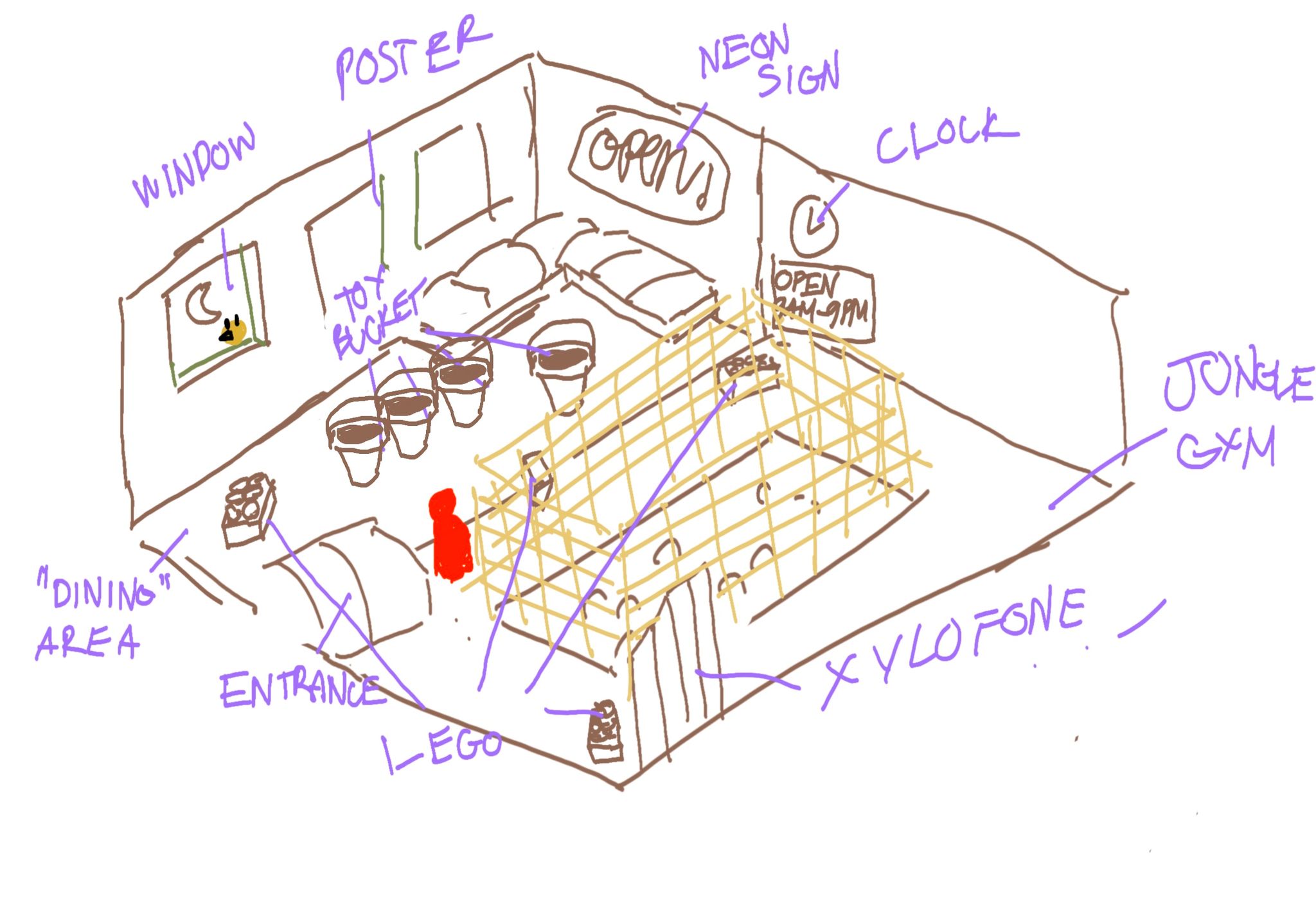
Level 2 Final Layout
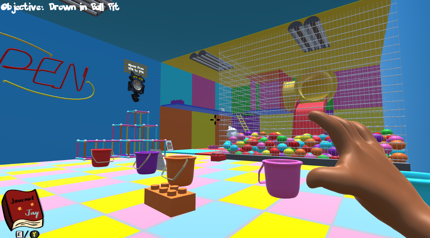
Using creative layout, the redesign fits the objective I layout. Similar to level 1, by smart placement of the player's starting position, with props within the level like spotlight, I was able to put focus on the familiar time changing mechanic, creating a rewarding feeling for players.
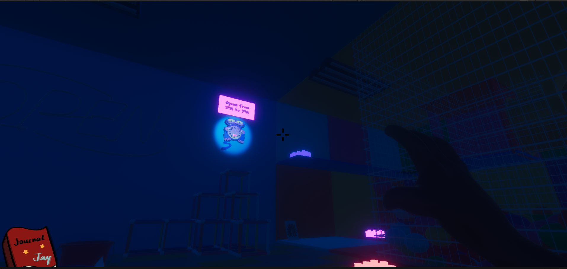
Initial player's POV
Only after solving a familar puzzle do the stage fully lits up, revealing the main objective of the stage locked behind a wall.
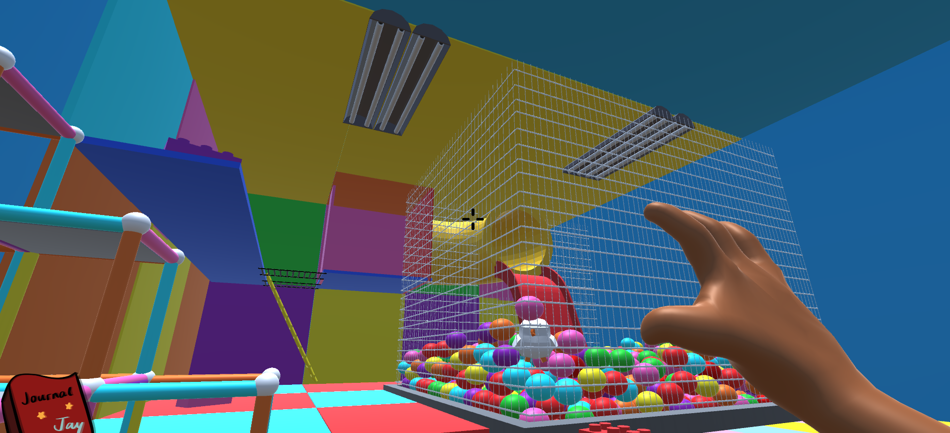
The stage lighting up after solving puzzle 1
The purposefully placement of level pieces, pairing with various effects with lighting allows for an open-spaced level design without overwhelming the player with the other puzzles.
Level 3: The Garden

Level 3 was the culmination of every puzzle mechanics with a truly open-level designed. The twist of the level was that puzzle pieces had to be done in a specific order.
While this mechanic was hinted in level 2, it had minor consequences. Ealier version of the game had the stage completely reset when failing this order, the consequences of failing was reduced significantly after various playtest.
Being a more open-ended level meant that I had to utilized clever level design to subtly lead players towards the objective of the level. Notably, I used 2 level design tricks that subtly guide players: elevation and desired path.
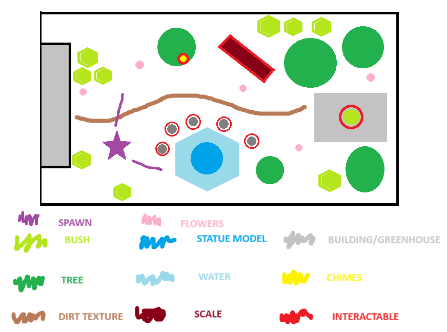
Garden level layout plan
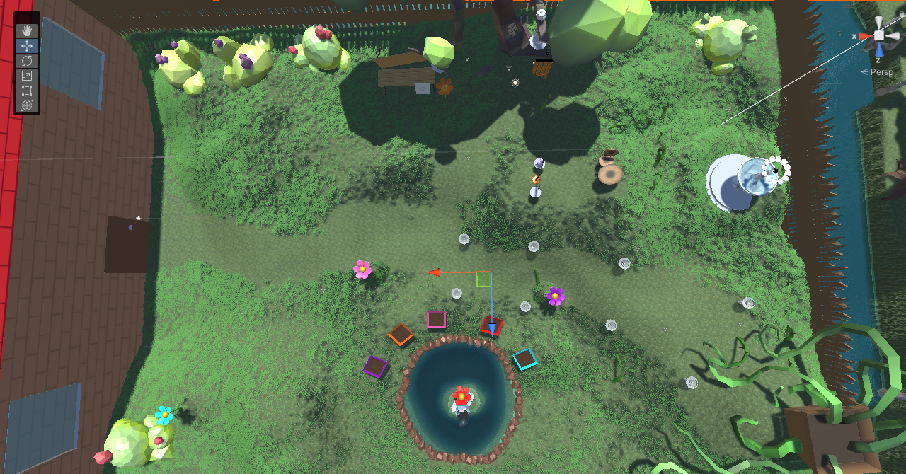
Garden level birds eye view
As I implemented the grass within the level, I left out grass-less spaces between the puzzle to create a "desired path" effect, hinting to where key puzzles would be! This is similiar to the lightning used in level 2.
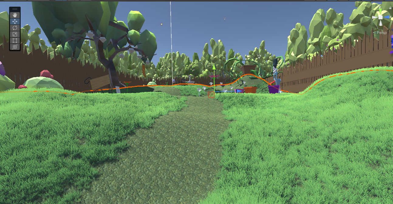
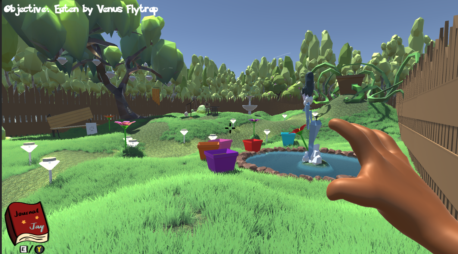
Level start player's POV
With elevation, I could segment puzzle pieces into different parts, with the main objective of the stage placed on the highest elevation, drawing the eyes towards it naturally:
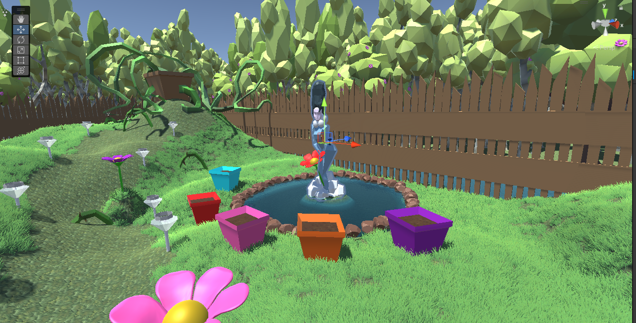
Puzzle 1
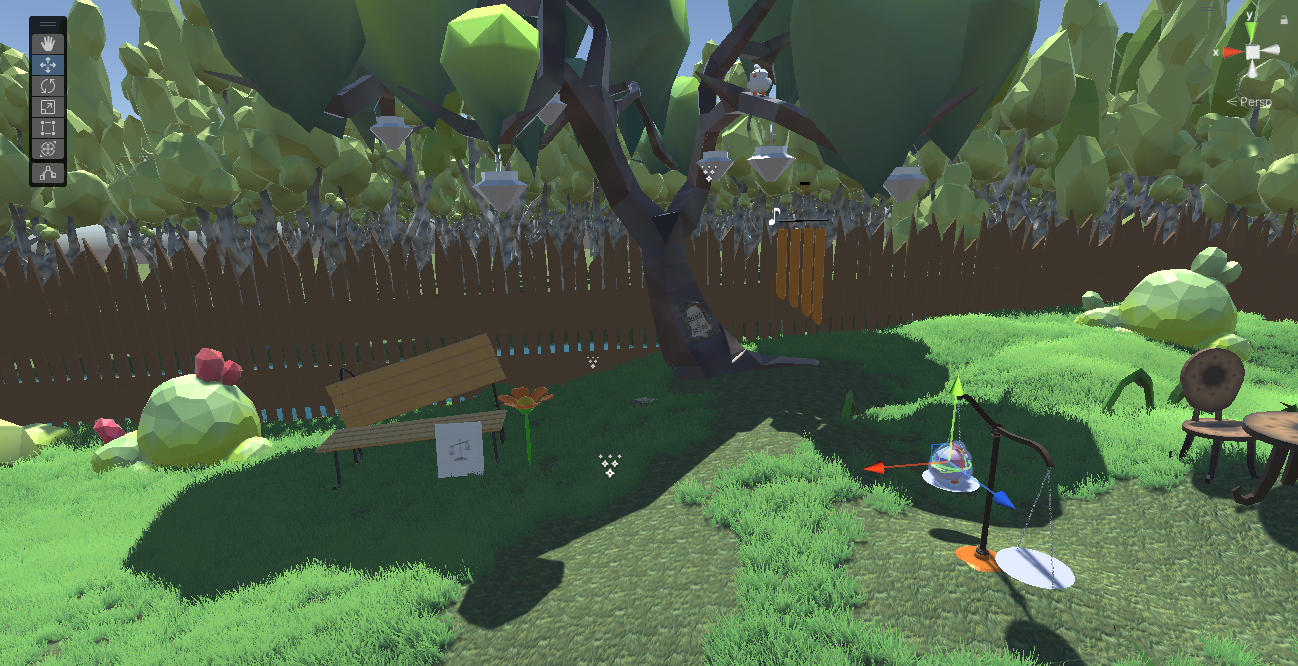
Puzzle 2
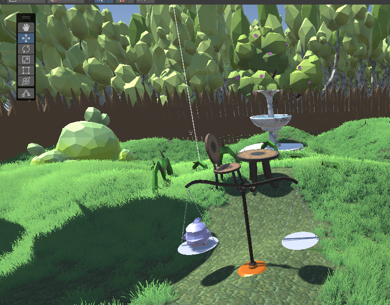
Puzzle 3
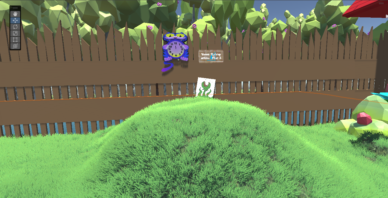
Puzzle 4
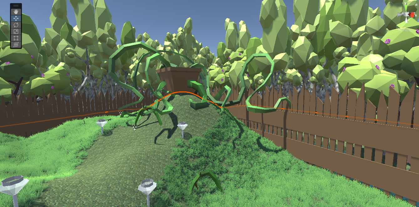
Level-ending man-eating plant!
3D Modeler
My other core contribution to the team was providing a core 3D artist, providing over 30% of the 3D asset for our game! I went into this completely a beginner to 3D modeling, with the goal to learn and create low-poly models for games. Here's a sample of some of my work:
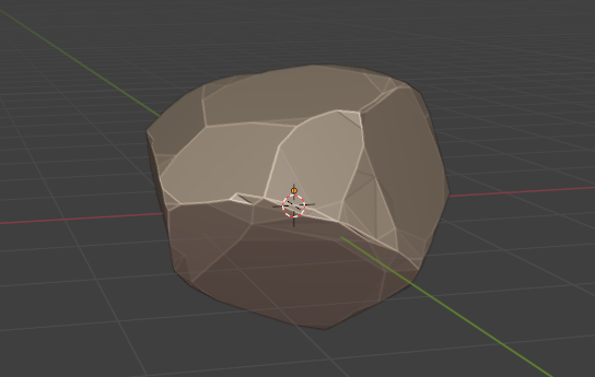
Stylized cartoon rock. Poly-count: ~450
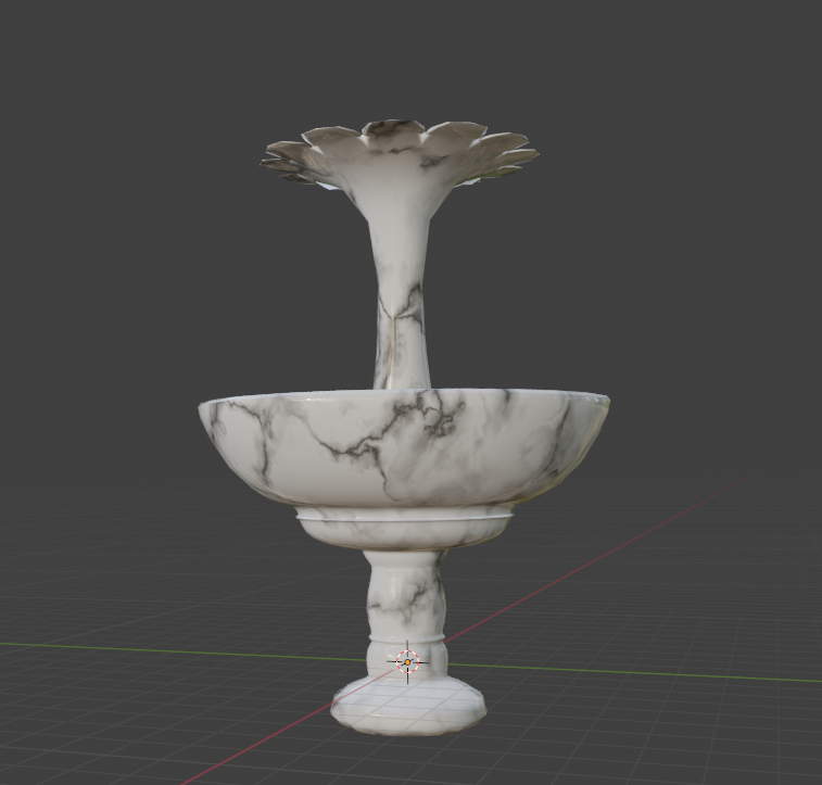
Marble Water fountain. Poly-count: ~2000
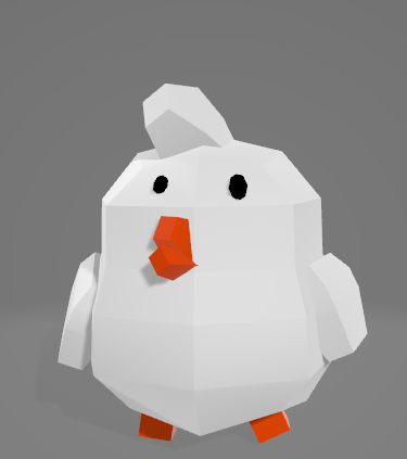
"Hint" bird. Poly-count: 760
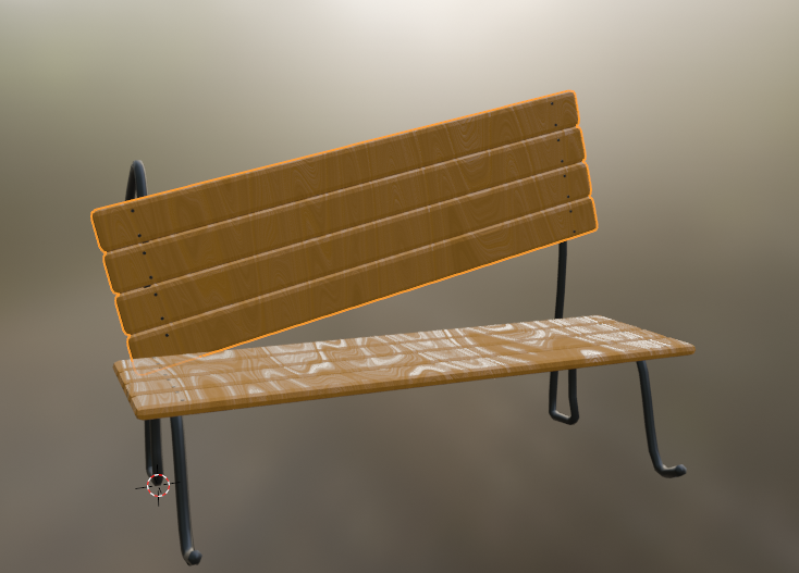
Garden bench. Poly-count: ~760
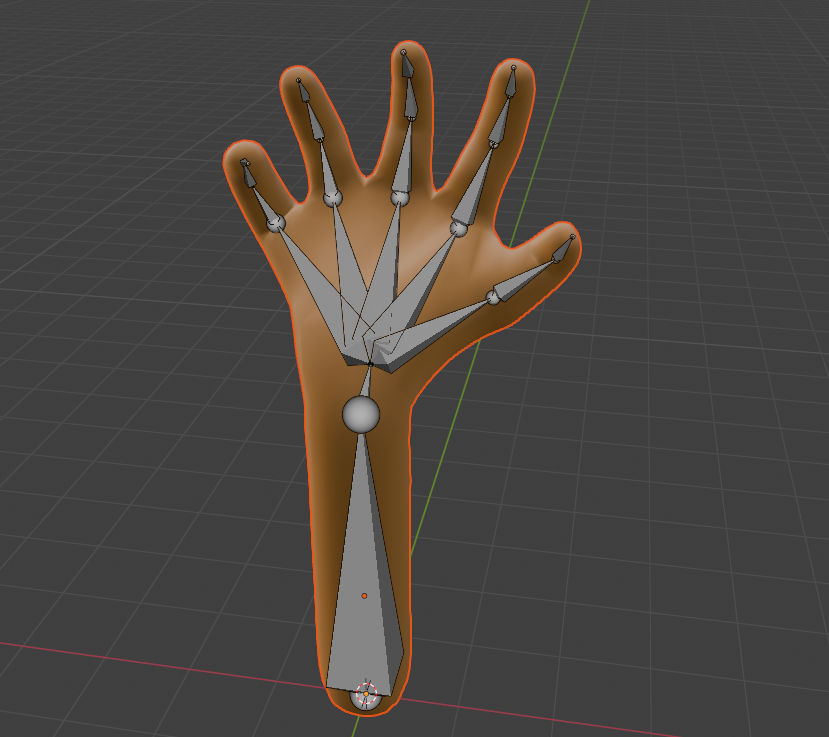
Open hand with rig.
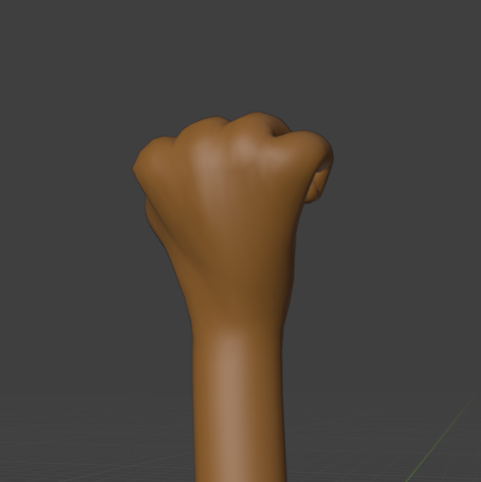
Closed hand when grabbing object.
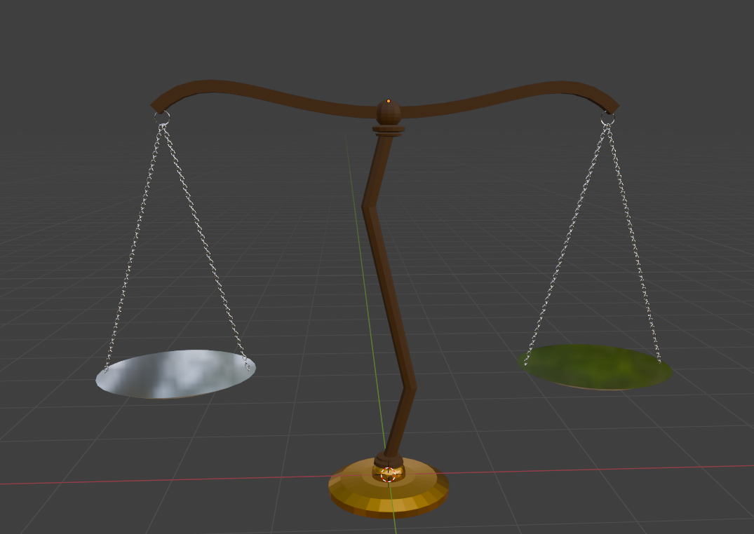
Scale. Poly-count: ~25000
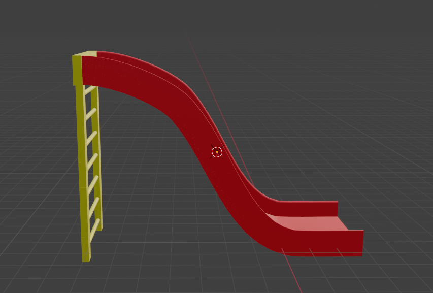
Slide: Poly-count: ~ 9200
While the Poly-count for some model could definitely be optimized more, it is ultimately sastifactory for the art direction our game was trying to achieve.